Sunday, 23 October 2016

Distribution methods


EMAP Bauer, Natmag, Conde Nast and IPC are the four main largest publishers in the UK. They are the institutions that produce magazines. 40-100% of the revenue are brought in by advertisers however the publishers control all the editorial and design content within the magazines. The amount of magazines being published and distributed depends on the circulation figures.

The flow of the magazines and the  printing process to the final selling in the shops is controlled by a network of distributers that is used by every publisher. Magazines are popularly sold in big newsagents and supermarkets, where they can target a larger audience and sell more magazines.

Sale or return: When publishers place their magazines at newsstands, if all the magazines are not brought then the remaining will be sent back to the distributor, the retailer will not be at a disadvantage here as they will get no further cost however the publisher will have a lot of wastage as the magazine will be thrown away after copies have not been sold as well as the fact it is environmentally damaging.

Freemiums- direct distribution: At busy locations such as train stations, supermarkets etc. free magazines are given out. The advertisements within these magazines increase as that's what they make their revenues from. 60% or more of the magazine is full of advertisements.

Subscriptions:
Magazines have subscriptions to allow there to be a wider audience through the social target. This allows an arrangement to be received for something, typically a publication, regularly by paying in advance or getting a discount. A regular core readership can be achieved for the magazine when readers get the magazines delivered to them on a regular basis (e.g. weekly, monthly). This can be easier for the readers when it is done through electronic distribution such as if it is sent to their ipads, kindle, inbox etc.. With some magazines gifts are received increasing the interest of the audience.

Online: E-zines- They are normally free, they are different to magazine websites and they carry mostly the same features as a hard copy, such as page numbers, to the ability to turn the page, pictures and adverts etc. However hyperlinks and videos can be inserted which would take the reader to another source.
Apps- On front cover magazines there are sometime QR codes that link to apps that may display some or all of the magazine. This can be accessed on smartphones or ipads for readers.
Electronic brand extension- Events and gigs as well as social medias such as Instagram, snap chat, twitter help extend the magazine brands. The online presence helps create more recognition from the audience and readers.




Saturday, 22 October 2016

Newsstand task

The magazines are placed carefully, the mastheads are visible to the audience allowing them to see which magazine it is so they can buy it. If there are any free prizes or gifts inside that will be on clear display also as people will be drawn in and interested in the magazine.

Photography session notes...


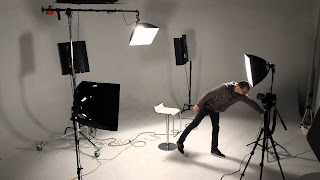
For this session we were introduced to the DSLR camera and studio lighting. This will help us when we come to shoot our photography for our magazines and to adapt it to our Front cover, contents and DPS to achieve good quality images and professional looking photography.

The technique uses three lights called the key lightfill light and back light. Naturally you will need three lights to utilise the technique fully, but the principles are still important even if you only use one or two lights.

We learnt that within the studio there were 3 lights set up. 

Key Light

This is the main light. It is usually the strongest and has the most influence on the look of the scene. It is placed to one side of the camera/subject so that this side is well lit and the other side has some shadow.

Fill Light

This is the secondary light and is placed on the opposite side of the key light. It is used to fill the shadows created by the key. The fill will usually be softer and less bright than the key. To achieve this, you could move the light further away or use some spun. You might also want to set the fill light to more of a flood than the key.

Rim light (Back Light)

The backlight is placed behind the subject and lights it from the rear. Rather than providing direct lighting (like the key and fill), its purpose is to provide definition and subtle highlights around the subject's outlines. This helps separate the subject from the background and provide a three-dimensional look.


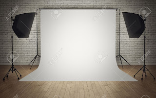
A backdrop and the lighting will work together to create a quality picture. When you have the proper type of lighting for your subject that complements your background you can highlight aspects of your subject including facial expressions, hair color and skin color. 

The main room lights should be off at all times when taking photos. The model should be standing 3-4 feet away from the backdrop, this is so they don't blend in.

On each light there's a lamp level numbered 1-6. Number one being very dim and 6 being over exposed. Number 3 is just the perfect number to start with but may be adjusted depending on the models height and what they are wearing.

The view finder allows one to adjust the zooming, with 18 being the lowest and 105 the closes. 


Thursday, 20 October 2016

Masthead design

    I started off with my magazine title for my preliminary task of creating a college magazine and settled on a black, bold yet simple font.
I shifted some of the letters up and down for an effect and added an oval shape to the 'O'.


I chose a texture that I liked from the internet and adapted it to my masthead design.

Monday, 17 October 2016

Evaluation- College magazine


Evaluation:

What went well… (Cover page)

Photography…

A suitable mid-shot was taken of an LSC student, "representing a happy, positive vibe. The image was clear and the student was clean and decent." The lighting for the picture was good, it was bright and I took it with a plain white background in order to make the editing process easier.

Use of text…

The masthead was placed in the top middle of the magazine to draw attention, it is big and is original with its unique font that I have drawn to make it look more ‘student’ friendly. "Cover lines are placed on the right and left of the cover star, it gives an overview of what’s inside the magazine and tells the audience what they are buying."

Image manipulation...

I didn’t have to do much to the image as the photography process went well, however I did use a filter that made a small change in the way the image looked.

Journalism...

Snippets of the magazine was presented on the front cover for readers to see. There are also some written aspects that are aimed to draw in the reader and interest them. E.g news and what's new.

What went well… (Contents page)

Photography…

A long- mid shot was taken of another LSC student to be placed on the contents page, another image was taken of the college.

Page layout…

I allowed the picture of another student to be put on the left hand side of the page, so readers can see that image first then go onto the written aspect of the page about the magazine as well as the page numbers and a small description underneath.

Image manipulation...

"The image of the LSC building was cropped due to a part of the image being blocked by a person. This allowed the image to look more professional."

What do I need to improve on… (Cover page)

Page layout…

I should make sure that when designing and placing features on the cover page, I should allow large spaces to be filled and appropriate pictures to be shown on the cover for drawing in the audience.

Image manipulation…

I could have added more filters to create different effects to make the cover seem more compelling for the audience. I could have added in props to make the student look more studious and passionate, also representing what the magazine is all about.

Journalism…

I could have included more advertisements and teasers on the cover where it will show a variety of journalism. The link to a big topic e.g. exam tips, within the magazine can be shown on the front cover for acknowledgement and a few lines of journalism to present and broadcast it further.

What do I need to improve on… (Contents page)

Page layout…

"The layout could consist of more writing and journalism as it seems a little too plain. It could also be fitted to allow more pictures of LSC and its students in to present the focus of the magazine as soon as the reader opens the magazine."

Journalism…

"Quotes can be neatly spread around the page for effect and readers interest which will lure them in further."


Developments…

·       Allow a more "studious atmosphere to be created within the pages". E.g. Images of students working, books, library etc.

·       I could develop the colour scheme further, where it is recognisable throughout the magazine and "allows uniformity to run within the pages."

·       There should be more written aspects on the contents page to show a thorough, "unique magazine that holds a lot of content and can be of interest to its readers."


Monday, 3 October 2016

Top of the Pops Media Kit Analysis

The top of the Pops magazine is published by the Uk publisher Immediate Media Co. This magazine is the UK's biggest selling teen title and has been number 1 for 20 years. Ranging from exclusive interviews, pictures and behind-the-scenes gossip all which make the magazine more female orientated where the average readership age is 12 and the overall print readership is 344k.

                              FREQUENCY          CORE AGE            CIRCULATION              READERSHIP

TOTAL
Pre-Teen Girls               n/a                            7-15                        110,497                         797k


The magazine's popularity online allows there to be a healthy
competition between other magazine companies.This also means         Facebook likes, 600K+         The magazine's popularity online allows there to be a healthy          
competition between other magazine companies.This also means             Twitter followers 8000+  
the availability of the magazine on different platforms increase as
the target audience is now being targeted and is increasing due
to the large online presence.

The influence of the audience's favourite famous celebrities can allow more purchases where things like large posters or free gifts may also make the target audience want to buy the magazine.


Sunday, 2 October 2016

XXL -DPS analysis

Analysis:


A mid-shot image is shown on the left hand side of the page, where they are giving the reader direct contact by having eye contact with them. The mise-en-scene reflect the hip-hop genre as the props he is wearing e.g. cap, necklaces and his serious face connote the stereotypical hip-hop look.

The article is written in depth which is shown as the reader can see there are three columns. The language within this is quite formal, it is a first person article which helps the readers understand and engage with the person speaking better.

A pull quote is placed on the right hand side in bold red lettering, which helps the reader have a insight on what the article will be about before reading and that will be the first thing they read after the large title as it is in writing that stands out.

Top of the pops - DPS analysis

Analysis:

Due to the magazine being mainly focused on the entertainment music feature, there aren't ant columns for the double page spread. Instead there are written statements about specific celebrities inside coloured shapes. The colour scheme is quite similar to that of the front cover and the contents page which shows a very consistent magazine.
The language used seems to reflect the target age as there are many small jokes and amusement features stated.
The main star on the pages seems to be ‘BeyoncĂ©’ which may allow the readers to stop and read due to her beng very well-known and popular in the pop genre. She is shown in a close up shot with a very smiley face to present a friendly tone and make the reader feel more engaged.


XXL magazine - Contents page analysis

 Analysis:


The contents page shows the consistent order of page numbers – the title of the page and a little information underneath about what you can find on that page.

The ‘new wave’ are seen here again in same clothing however different poses and they are all placed in mid-shots.
The colour scheme is consistent with the front cover which shows a uniformity throughout the magazine.
Due to the price being £3.95 there is more information than of those magazines with a lower price.
Bold writing separates the more important information and details from the rest as the reader instantly notices certain more eye-catching areas before anything else.


A long shot is placed here however there is still eye contact, which engages with the audience.
The language here is quite informal e.g. 'sets em' straight'.


XXL magazine -Front cover analysis

Analysis:


The front cover of the XXL magazine show ‘The new wave’ which is stated clearly through the main cover line.
A consistent colour scheme is shown as there are 3 main colours which are, white, red and blue.
The cover stars are all framed in mid/long shots and have direct communication with the audinece due to eye contact at eye level.
The mise-en-scene show that they are all wearing some type of expensive jewellery indicating their wealth. They are all wearing white which could show they are all as ‘one’ and to create a more appealing effect for the audience. The hip-hop genre is shown from their postures and attitudes, e.g. caps, hand symbols and ripped clothing which emphasise the fierce, modern music genre.
Small cover lines are placed on the right
The masthead is on the top left, and is slightly covered however it is widely recognisable as a brand and therefore doesn’t matter if it gets covered.
The audinece consists of the gender being 78% male and 22% female the average ages being 29.

Top of the Pops - Contents page analysis

Analysis:

There is an editorial letter from the junior writer that states a little about what’s further inside the magazine. It specifically refers to girls which would be directly addressing and engaging with the target audience.

Instead of an organised page layout it is very similar to the front cover in terms of being very disorganised and in terms of the same colour scheme. An image of the front cover is put at the top right hand corner and there are arrows with page numbers pointing to different areas that can be further seen inside.

There are pages of the magazine placed underneath that weren’t put on the front cover but are directing the readers by placing page numbers next to them.

A few images are set out at the bottom with captions linked to them explaining what that page/feature is about and what more we can learn and see.

A top tips list is arranged at the side for readers to differentiate this magazine from others and become more intrigued.

There are credits at the side of the page, for those who helped create the front cover photos.

Due to the price of the magazine the content isn't much as you get what you pay for. In this case there isn't much information stated.


Top of the pops - Front cover analysis

                                                                                      Top of the Pops -Front Cover analysis
                                                                                    
First glance at the front cover and it all seems a little too crowded and in your face. This could be due the target audience being the younger generation and something with a lot of key elements and entertainment features will draw them in.

The colour scheme doesn’t seem very consistent however the main colours shown are yellow, pink and purple –not only are these bright, eye catching colours but they also reflect the genre of pop as it is modern and popular and can be easily noticed with its growing audience.

The masthead is in the top left hand corner allowing easy recognition by readers when its placed in shops, and so it doesn’t get covered when other magazines overlap. It is also where most people generally look for any identification.

The cover line states ‘So jokes’ this is the biggest element on the cover and could represent the entertainment feature and indicate what is inside for readers to see. It is in all capitals which could further emphasise the enthusiasm with the magazine.

The smaller cover lines tell us more features that come up within the magazine.


The main cover stars are youtubers Joe and Casper who are placed from the middle with mid-shots, they give the audience direct contact as they are at eye level which engages the readers focus.
The mise-en-scene of the cover stars is very plain and simple, they are both wearing similar black t-shirts with writing on them, this could be to help differentiate the rest of the elements on the front cover to them.
A puff/flash is placed in the bottom right where readers will turn over the page, this includes a variety of famous celebs that are featured inside with the caption ‘full of fit fancies including…’ this engages the reader and leaves them wanting to know more. The language from this phrase is written in alliteration which makes it more appealing for the reader and allows it to stick in their heads. The use of many popular celebrities helps create attention as well-known celebrities such as ‘Justin Bieber’, ‘BeyoncĂ©’ and Shawn Mendes are shown.
There are many small pictures placed about the page with small captions or amusing jokes.
The skyline of the cover states a rhetorical question allowing the audience to be engaged as well as the mention of a quiz inside, which will lead them further on inside.
The Barcode/QR/website are at the bottom put with the date line/price/issue number.

The target audience is girls aged 10-15.
The magazine is distributed weekly with a frequency of 4.
The price of the magazine is £2.99