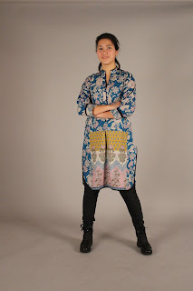
 I found from this that the house style had improved and I had linked my colours well. It also consistently worked throughout my magazine and looked compatible with my target audience.
 I like the layout that the text is in columns and not in blocks so it looks easier to read on Final music magazine DPS
on 03/02/17
I like the variety of different pictures used however maybe add page numbers on Final music magazine Contents page
on 03/02/17
I like the colour scheme as it works well with her clothing so there's reasoning as to why those colours were picked. on Final music magazine FC
on 03/02/17


